

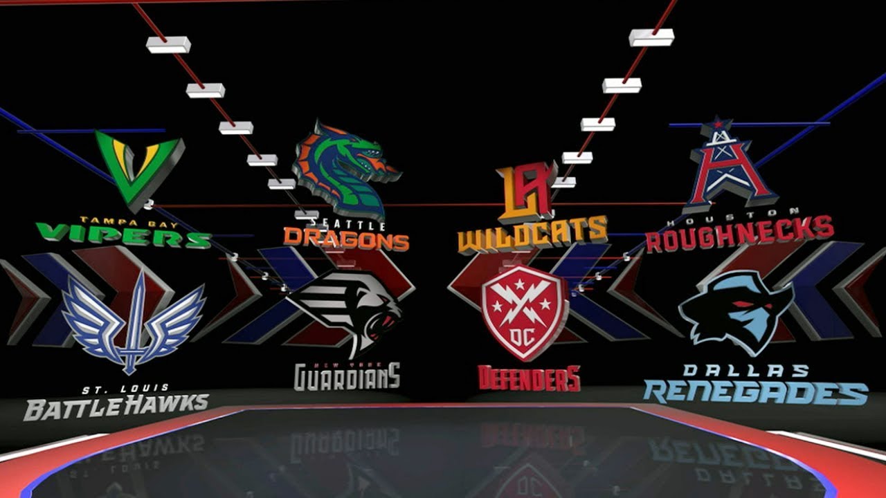
This is a day a lot football fans have been looking forward to…and we’re one of them. The XFL released the names and identities of their 8 teams that will be involved in the (2nd) inaugural season in 2020. Of course these will be met with snark and ridiculed by many. But since we’re actually interested, we’ve gone to great lengths to grade each team’s identity so you don’t have to.
Dallas Renegades
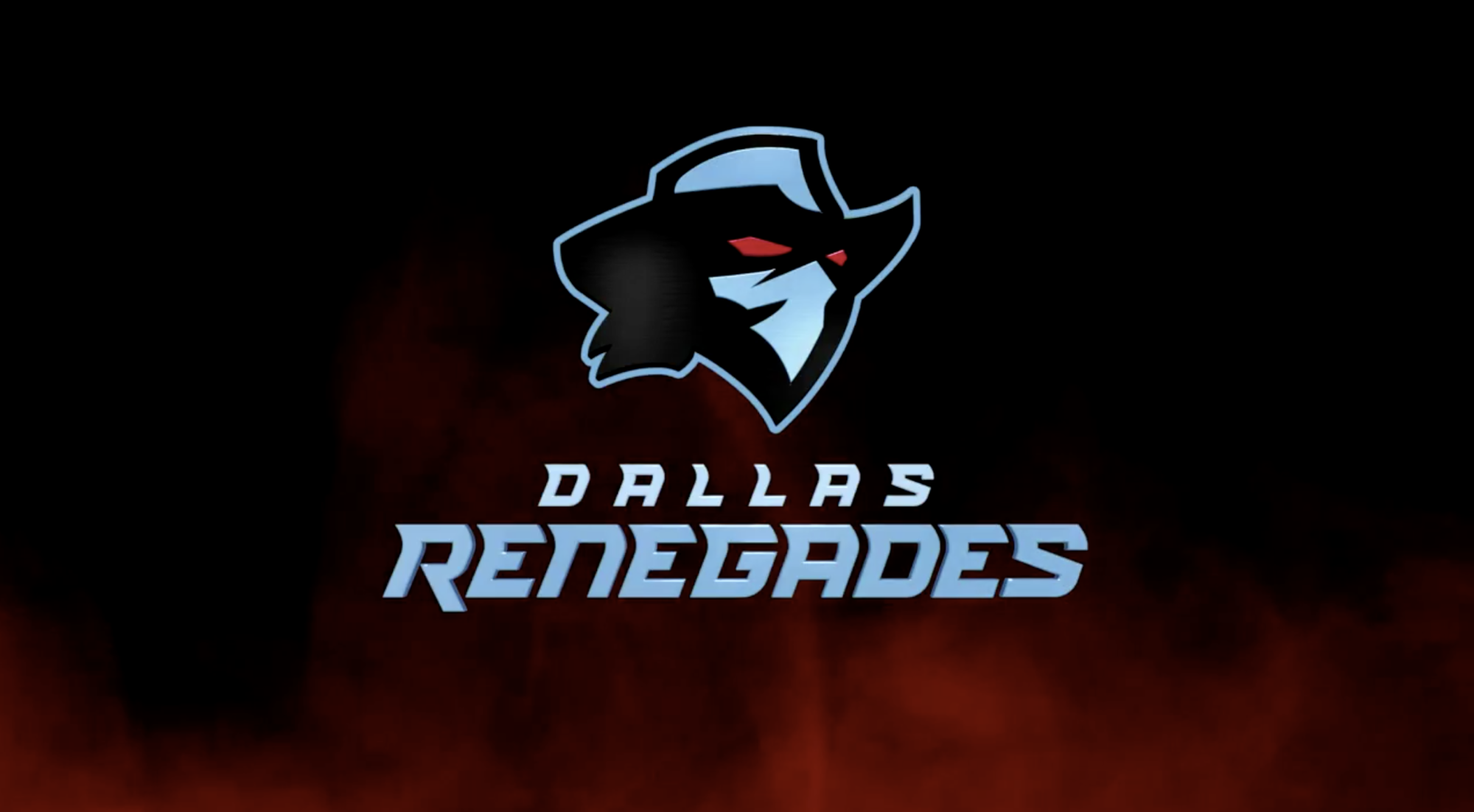
Grade: T
I like the name, Renegades is a cool name. They have a bad ass agenda attached to it too. Logo is pretty snazzy. Not my favorite, but it’s better than a lot.
DC Guardians
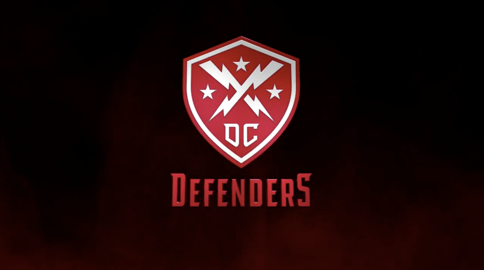
Grade: Z
The worst of the bunch. What is a defender? Attached to DC, it looks like an Avengers rip-off. You like the Avengers, well here’s the DC Defenders! The logo is lame too. There’s too many things in that crest.
Houston Roughnecks
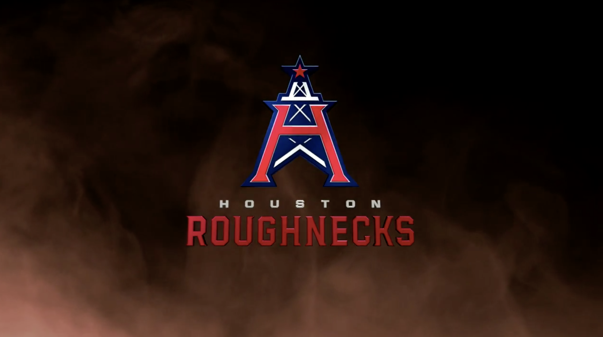
Grade: R
I don’t know how they got away with this one. The logo mimics the old Houston Oilers logo from years ago. I guess it’s been long enough. The name is cool too.
LA Wildcats
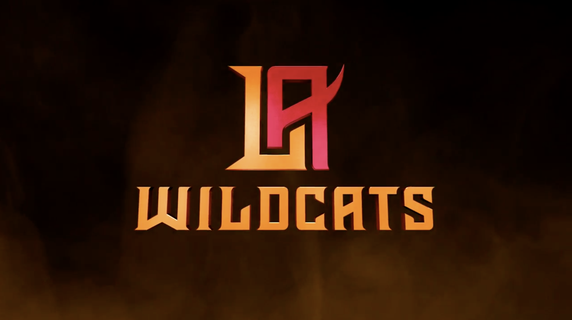
Grade: E
The colors are cool. I feel like the name isn’t LA though, not a name for the 2nd highest market. Of course the logo is just the letters LA, in typical LA fashion. I don’t know if that’s good or bad.
New York Guardians
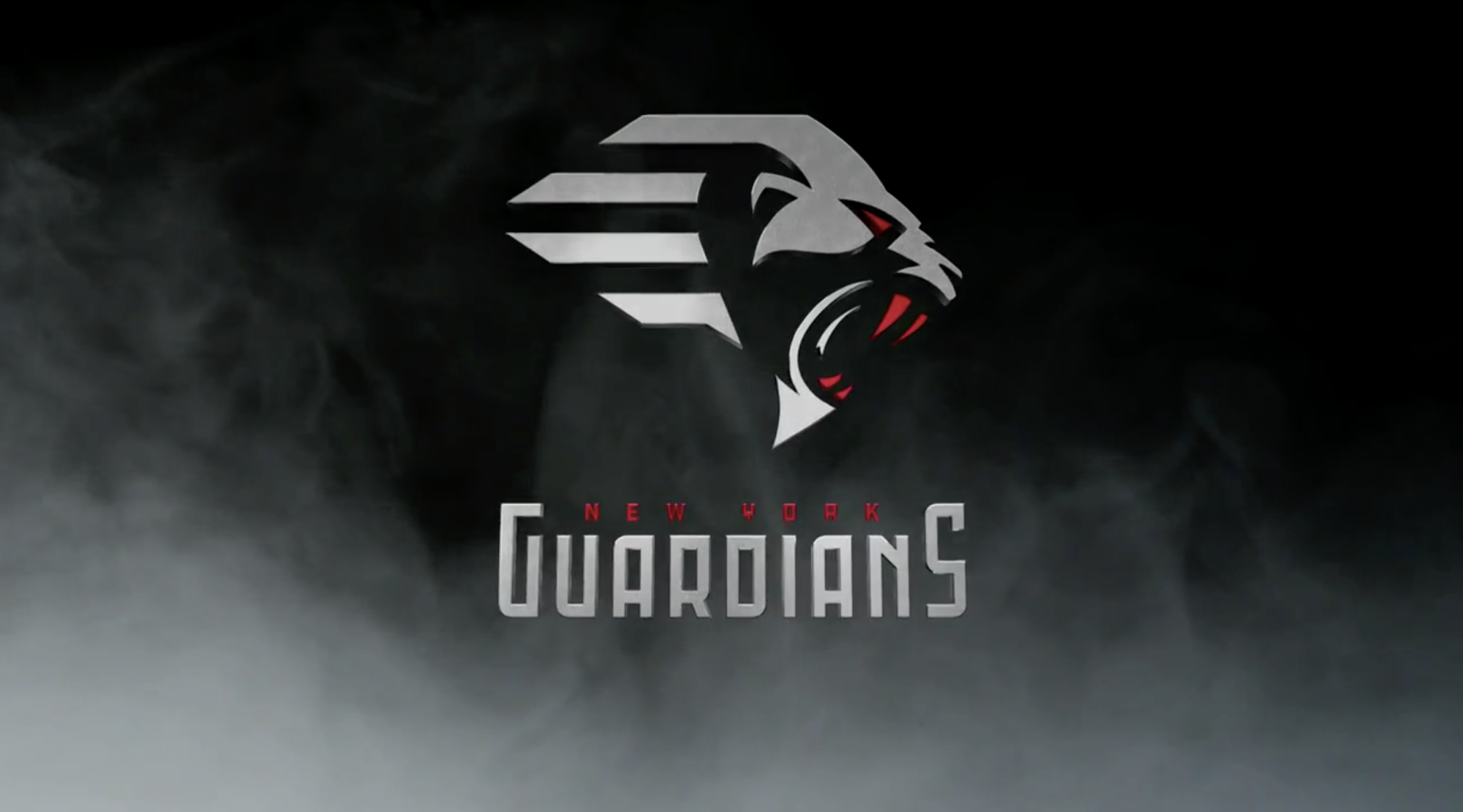
Grade: G
The best logo and name out of them all. The Guardians name fits New York so well. The logo could be a little better since it’s based on a gargoyle. Black and grey with shades of red is such a rad color scheme.
Seattle Dragons
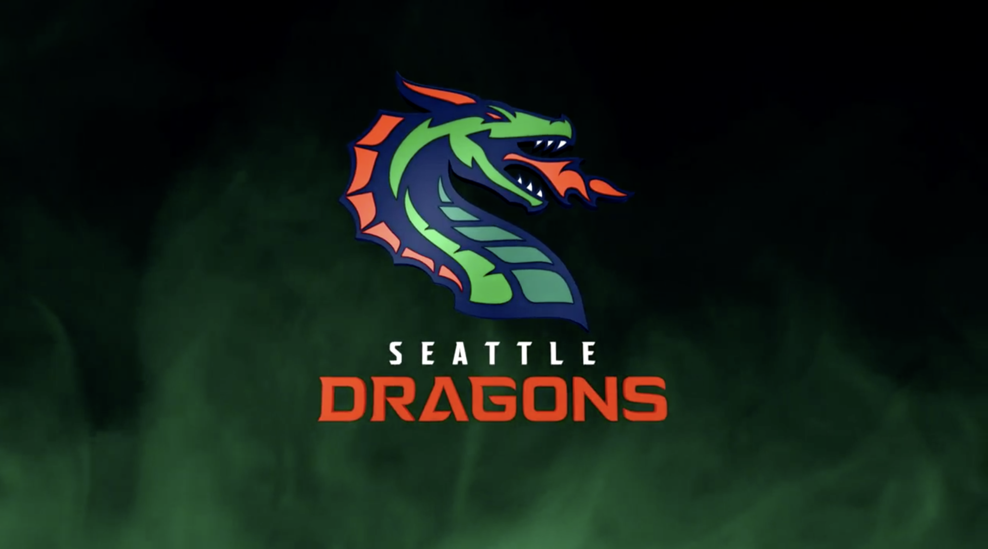
Grade: V
This had such potential. Dragons is a cool name, but it seems like there could have been more creativity added to it. DragonTails, DragonClaws, DragonBreath could have been cooler but I’m sure it would’ve been met with such hostility. The logo is pretty cool too, but like the name, I feel like it could’ve been a little more creative.
St. Louis BattleHawks
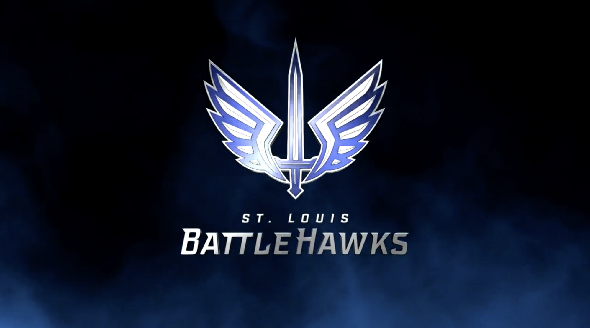
Grade: P
This logo is so cool. It may not be the most original, but it’s sleek and shiny. The name is kind of clunky but attached to the identity, it may the best out of them all.
Tampa Bay Vipers
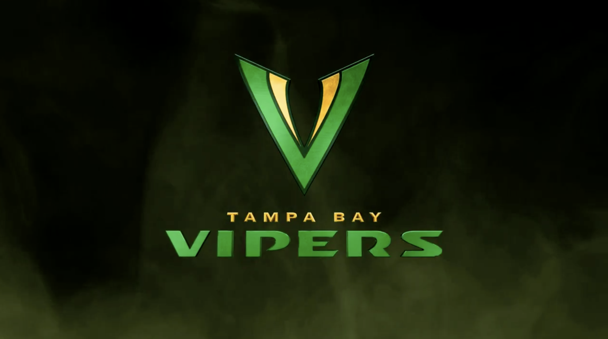
Grade: W
These logos are neat. The colors look elementary though. And I hate snakes, so I’m not the biggest fan of the whole identity. I would hate to hear loud snake noise in the stadium for the entire game.
There you have it. I hoped you learned something today. See you in a few months.